Yahoo News Redesign
Before

As a reader, Yahoo News comes across as a fast-moving digital platform focused on accessibility and a high volume of content. The site is generally functional and visually engaging, but there are a few areas where its design, organization, and presentation could be refined to improve the overall experience without losing its emphasis on engagement.
One of its strengths is the clear organization of the homepage. Sections like top stories, trending topics, and category-specific news (politics, entertainment, sports, etc.) make it easy to navigate and quickly find areas of interest. Placing “Top Stories” at the top is especially effective in highlighting major headlines.
Visually, the site keeps things simple with a mostly neutral palette—white backgrounds, dark text, and occasional purple or blue accents tied to Yahoo’s branding. This helps readability, though leaning a bit more into the purple branding could give the site a stronger identity.
Layout is another area that could use some tightening. Spacing and alignment can feel inconsistent at times, and when combined with ads and sponsored content, the page can come across as visually noisy. A more consistent grid and cleaner spacing would help everything feel more polished.
A bigger challenge is balancing quantity with curation. Right now, the platform leans heavily toward volume, offering a wide range of stories to appeal to different audiences. While this supports engagement, it can dilute the impact of individual articles. A slightly more curated approach—highlighting fewer, more meaningful stories or offering smarter personalization—could improve the experience without hurting traffic.
After
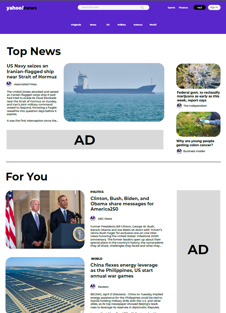
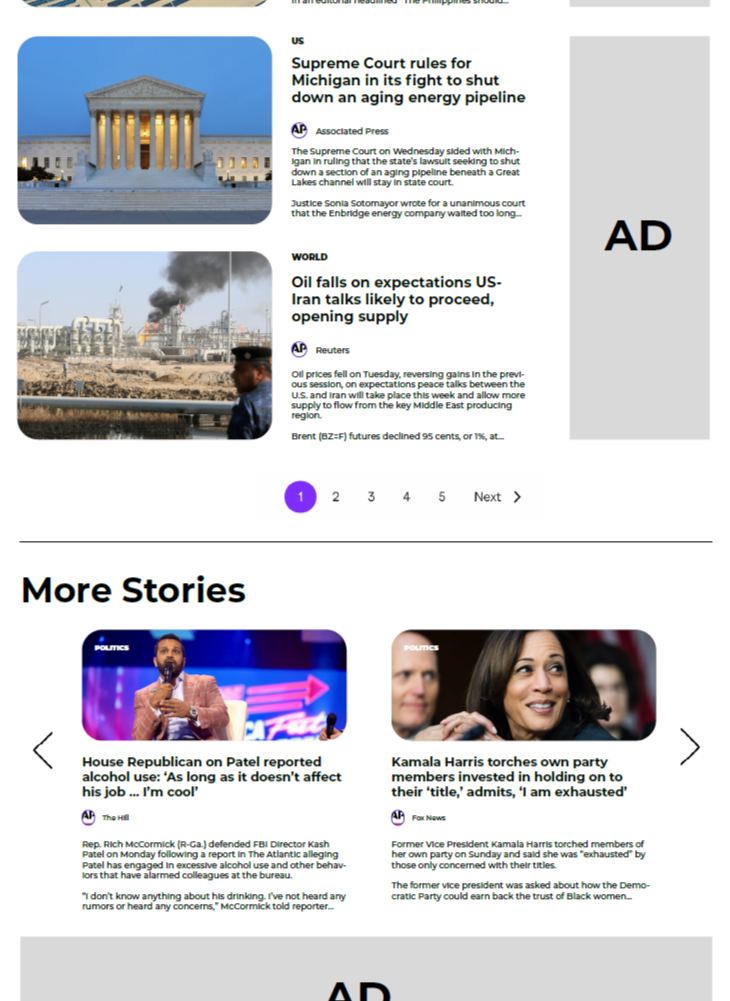
This updated homepage shows improvement in organization, clarity, and usability. As a wireframe, it presents a streamlined news platform that is easier to navigate while still supporting high content volume.
A key strength is the clear visual hierarchy. The “Top News” section is prominently placed, making it immediately visible. A primary story with a large image, supported by smaller stories, establishes a clear order of importance and allows users to quickly identify major headlines.
The structure is more defined and predictable. Sections like “Top News,” “For You,” and “More Stories” create a logical flow from key headlines to additional content, helping users navigate intuitively rather than feeling overwhelmed.
Spacing and layout improvements enhance readability. Consistent margins and separation between sections give content room to breathe, improving scanability. Repeating alignment patterns between images and text reinforce consistency across the page.
Card-based article grouping also improves clarity by organizing content into distinct visual units, especially in denser sections like “For You.”
Visual elements support engagement effectively. Images add context, while the larger feature image in “Top News” acts as a focal point without disrupting balance.
Branding choices help define structure. The purple header and footer establish identity, while the neutral content background keeps attention on readability and hierarchy.
Overall, the wireframe delivers a cohesive, user-friendly homepage that balances dense content with clear structure, supporting both scanning and deeper engagement.
Before
After
The redesigned article page reflects a clear effort to create a more readable, structured, and visually balanced experience for users.
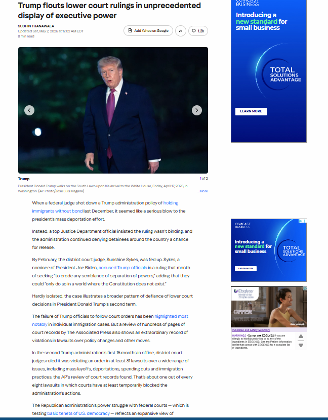
One of the most noticeable improvements is the treatment of the article header and lead content. In the updated version, the headline is given more space and stands out more clearly, making it easier for readers to immediately understand the topic of the story.
The use of imagery is also more effective in the redesigned version. The main image is larger, more prominent, and framed with softer edges, which helps it feel integrated into the layout rather than simply placed within it. This image acts as a strong visual anchor at the top of the article. In addition, the image placement aligns more closely with the headline, reinforcing the narrative flow and ensuring the visual supports the story rather than sitting apart from it.
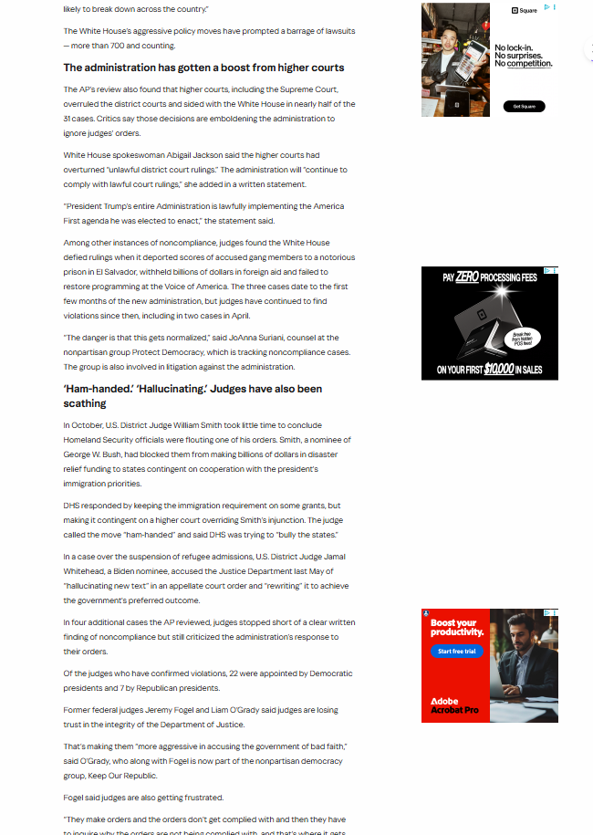
Another key improvement is the readability of the body text. In the revised layout, the text appears more comfortably spaced, with clearer line breaks and a more consistent column width. This makes longer sections of text easier to follow and reduces visual fatigue. Paragraphs feel more distinct, allowing readers to scan or read in depth without losing their place. The improved line length also supports better readability on different screen sizes, especially on smaller devices where dense text can become overwhelming.
The overall page structure also feels more intentional. The content is better aligned within a defined central column, which creates a stronger sense of order. As a result, the page feels cohesive and easier to navigate. This consistency also reduces cognitive load, since users do not need to reorient themselves as they move through different sections of the article.
Advertisements, while still present, are more contained within the layout. In the updated version, they are positioned in a way that separates them from the main reading flow, allowing the article content to remain the primary focus. The improved separation also reinforces a clearer distinction between editorial and promotional content, which supports trust and readability.
Additionally, the inclusion of a “More” or related stories section alongside the main article provides a clear path for continued engagement. This helps extend session time in a way that feels organic rather than forced.
Overall, the redesigned article page demonstrates a stronger balance between content, layout, and visual elements. By refining spacing, improving alignment, and giving greater emphasis to key components like the headline and main image, the updated version creates a more user-friendly and engaging reading experience. It also shows a clearer understanding of how users consume long-form content—scanning first, then reading in depth—which strengthens both usability and editorial effectiveness.
Before
After
In the original design, the layout emphasizes access to a wide range of content at once. Multiple stories are visible simultaneously, accompanied by varied image sizes, headlines, and embedded elements. This approach supports quick browsing and scanning, which is useful for users looking to move efficiently through different topics. At the same time, the visual structure is more flexible than rigid, with less emphasis on a single focal point. Branding elements, such as Yahoo’s identity, are present but share space with the broader range of content and interface components.
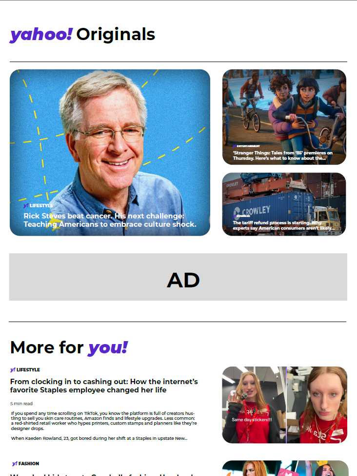
The new design introduces a more unified visual system that brings branding into stronger focus. The “yahoo! Originals” header is more prominent, immediately signaling a distinct editorial space within the broader platform. Typography choices feel more consistent, and the use of Yahoo’s signature purple helps tie different elements together across the page. These decisions contribute to a clearer sense of identity, making the experience feel more intentional and connected to the brand.
A key difference is the shift in layout structure. The new design uses larger, more defined content cards and a clearer hierarchy, with a primary featured story anchoring the page. Supporting stories are arranged in a way that complements this focal point, guiding the user’s attention more gradually. This creates a more paced reading experience, where content is encountered in a sequence rather than all at once.
Spacing also plays an important role in the updated design. Increased whitespace between elements allows each story to stand out more distinctly, which can make the interface feel easier to navigate. Instead of relying on density to communicate volume, the design uses spacing and alignment to organize information. This contributes to a smoother visual flow and helps users engage with individual pieces of content more deliberately.
The handling of advertisements reflects a similar sense of structure. In the new design, ads are clearly separated into designated areas, making their placement more predictable within the layout. This separation helps maintain a consistent rhythm across the page, where editorial content and sponsored content are visually distinguishable without interrupting one another.
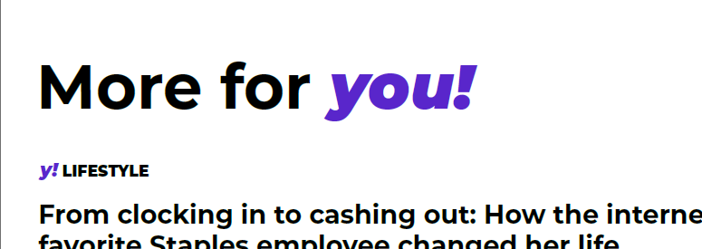
The addition of sections like “More for you!” introduces a layer of personalization and extends the browsing experience beyond the main featured stories. The combination of text-based previews and more visually driven elements—such as vertically oriented images—connects the platform to broader digital media trends. This allows the content to feel both editorial and culturally current, bridging traditional article formats with more contemporary visual storytelling styles.
Before
After

The shift from the original design to the new design is especially noticeable in the treatment of the footer, even though the original experience did not include a clearly defined one. Instead, the earlier layout relied on an infinite scroll structure, where content continuously loaded without a strong sense of closure or endpoint. While this approach supports extended browsing, it also means that structural elements like navigation, brand reinforcement, and utility links are less centralized and harder to access in a consistent way.
In the original design, key informational links—such as site navigation, policies, and account-related actions—are dispersed or secondary to the main content feed. Because the page is designed to keep users scrolling, there is no natural moment where all of these elements come together. As a result, the brand experience remains focused on content consumption rather than on providing a holistic view of the platform’s ecosystem.
The new design introduces a dedicated footer that serves as a clear structural anchor at the bottom of the page. This creates a sense of completion while also offering a centralized location for important links. Sections like “About Us,” “Topics,” “Mail,” and “More” organize information into distinct categories, making it easier for users to locate resources such as careers, contact information, login options, and legal guidelines. This added structure supports both usability and clarity without interrupting the overall browsing flow.
From a branding perspective, the footer plays a much more active role. The bold “yahoo!news” mark, combined with the full purple background, reinforces the visual identity in a way that is immediately recognizable. The consistent use of brand color transforms the footer into more than just a utility space—it becomes an extension of the brand itself. Social media icons are also integrated directly into this area, creating a bridge between the platform and its presence on other digital channels.
The introduction of this footer also balances the infinite-scroll experience rather than replacing it entirely. Users can still engage with content continuously, but they are now given a clear endpoint where they can pause, reorient, or navigate elsewhere. This adds a layer of control and orientation that was less defined in the original structure.