True Grey Website
Project Overview
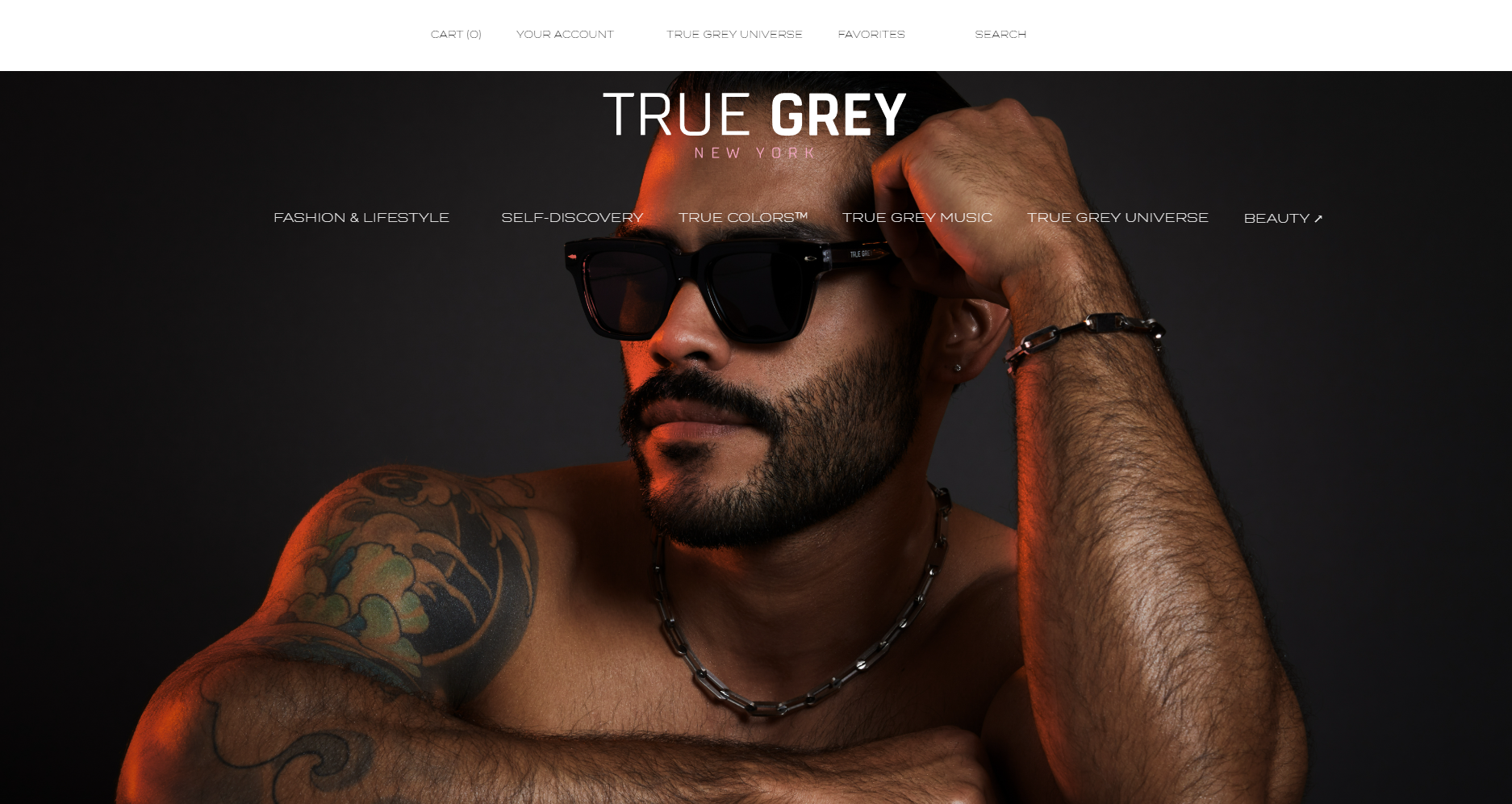
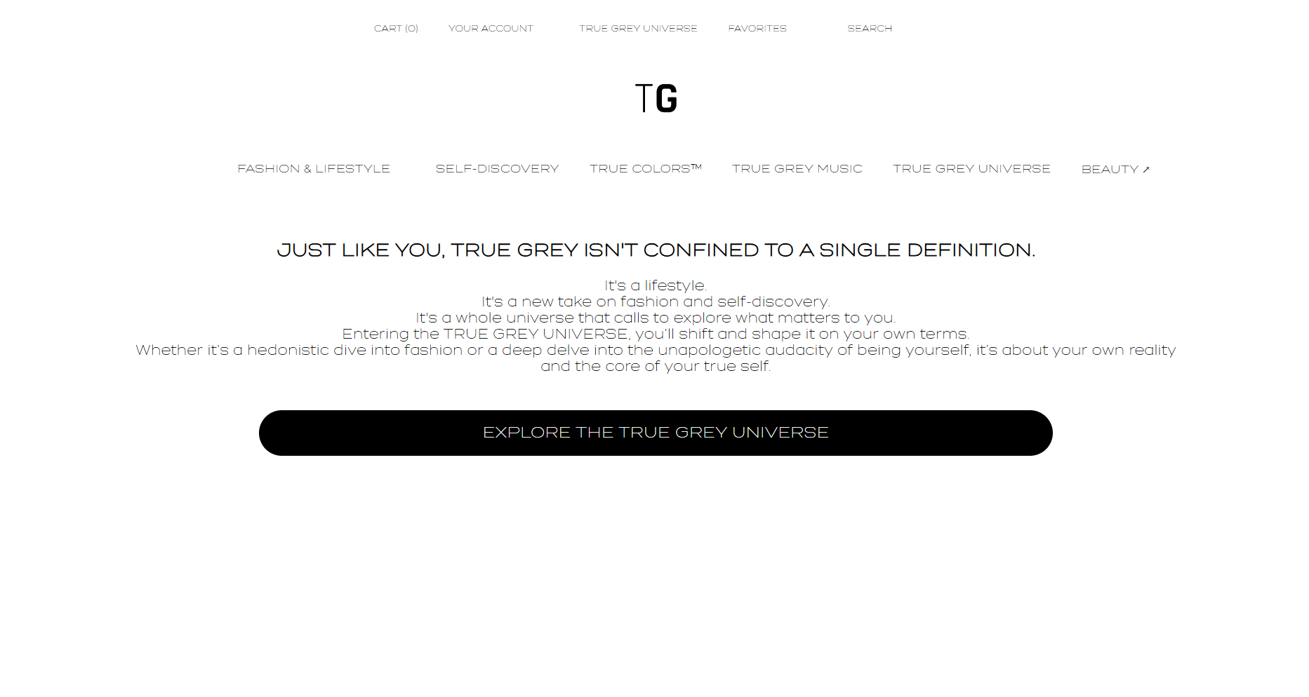
True Grey is a luxury, lifestyle e-commerce platform designed to deliver a premium digital experience centered on men’s fashion and accessories. The brand offers a curated selection of jewelry, eyewear, and underwear, emphasizing quality and refined design. The platform features an interactive quiz that personalizes product recommendations, guiding users toward curated combinations tailored to their individual style and preferences. I singularly was the Web Developer & Designer. The project was halted by the client due to financial obstacles in production.
Process
The development of True Grey began with an initial consultation with the client to establish a clear understanding of the desired look, feel, and overall brand direction for the site. This early stage focused on identifying key themes such as boldness, experimentation, and an immersive user experience, which would ultimately guide the design decisions throughout the project.
Following this, extensive research was conducted into the client’s inspirations, particularly established fashion e-commerce platforms. The visual identity and elevated aesthetic of the Balmain Paris website, along with the streamlined usability and product structure of Zara, served as key reference points. From Balmain, the project draws inspiration in its use of bold typography, high-contrast visuals, and a luxury-forward presentation, while Zara influenced the clean layout and intuitive navigation systems.
Using these insights, an initial prototype was created to explore layout, user flow, and visual hierarchy. This prototype allowed for early testing and refinement, ensuring that both aesthetic and functional goals were aligned before development began.
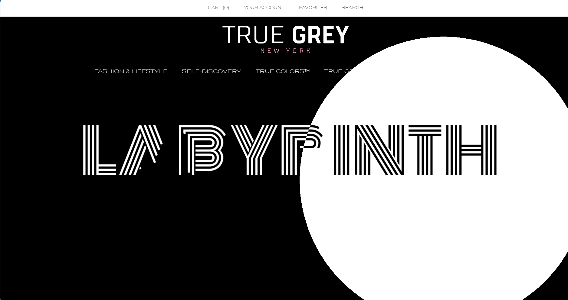
The final stage involved coding the site, where the design was brought to life with added layers of bold, experimental, and immersive elements. These included dynamic visual sections, striking typography, and engaging interactions that enhance the overall user experience.
These design choices also improve accessibility and usability by enabling seamless scrolling and intuitive navigation, allowing users to engage with the content effortlessly while maintaining a visually compelling experience.
Creative Direction & Design Principles
The creative direction of the True Grey web page, with its moving and animated elements, leans heavily into immersive, dynamic storytelling through interaction. By incorporating motion, the page feels alive rather than static, giving users a sense that the interface is responsive and organic. These animations serve multiple purposes:
Depth and Immersion – Subtle movements, parallax effects, and animated elements create layers that mimic real-world dynamics, making the page feel more spatial and engaging.
Guided Attention – Moving elements naturally draw the eye, helping highlight key content or calls to action without heavy-handed prompts.
Playfulness and Personality – Animations can give the brand a distinctive voice, whether it’s through micro-interactions (like hovering effects) or more pronounced, almost narrative-driven motions.
Fluid Experience – By integrating consistent motion and transitions, users experience a smoother, more intuitive journey across the page, which encourages exploration and retention.
Overall, the creative direction emphasizes an interactive, visually rich, and tactile digital environment, where movement isn’t just decorative—it enhances usability, storytelling, and emotional connection with the brand.
This website was first made in HTML, CSS, JS, with other JS frameworks, then moved to WordPress.