Virtru Newsroom
Project Overview
Virtru’s newsroom serves as a key touchpoint for journalists, partners, and the public seeking information about the company. However, the existing experience lacked clear information hierarchy, easy navigation, and essential media resources. This project focused on redesigning the newsroom to improve usability, accessibility, and content discoverability while aligning with Virtru’s brand and communication goals.
The Problem
How might Virtru redesign its newsroom to better support journalists and external audiences when critical resources—such as a media kit—are missing and content is difficult to navigate? How can the newsroom communicate credibility, clarity, and accessibility at first glance?
Research & Discovery
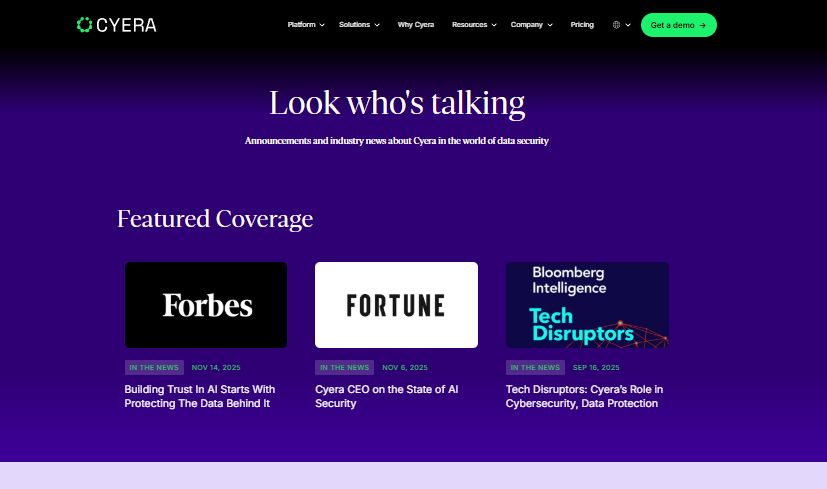
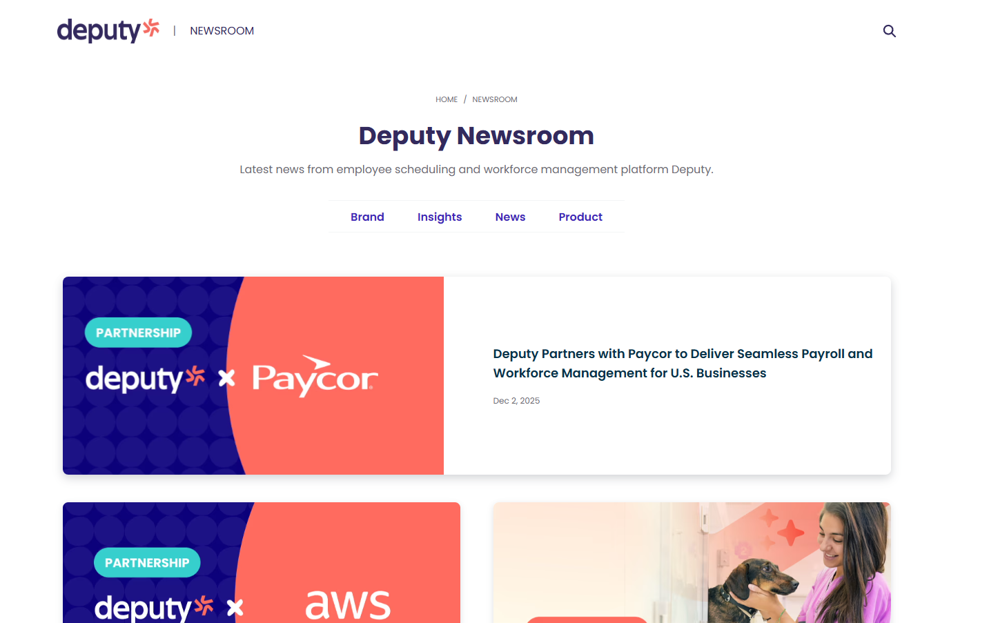
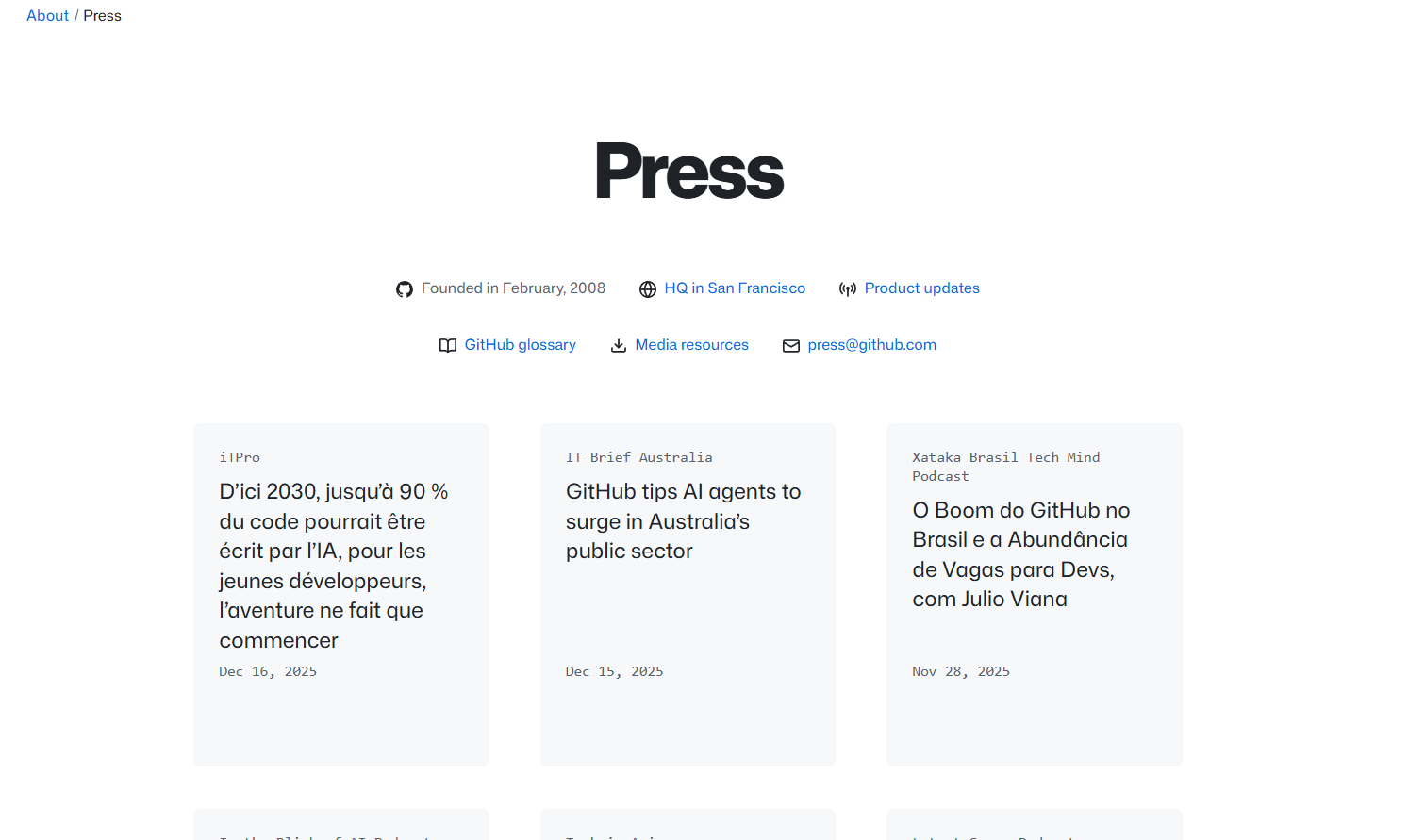
I conducted a competitive analysis of newsroom pages from similar technology and cybersecurity companies to identify common patterns and best practices. This research revealed consistent expectations such as persistent navigation, clearly labeled press assets, and scannable content blocks.
To ground design decisions in business needs, I met with Virtru’s communications director, creative director, web developer, and marketing manager. These conversations helped clarify constraints, brand priorities, and technical considerations, ensuring the redesign would be both user-centered and feasible.
Goals
Improve information hierarchy and readability
Add a clearly accessible media kit for press use
Enhance navigation without overwhelming users
Align newsroom structure with industry best practices
Key Insights
Journalists expect immediate access to logos, brand guidelines, and press contacts
Important newsroom content was buried, requiring excessive scrolling
Navigation lacked consistency and did not support quick information retrieval
Design Process
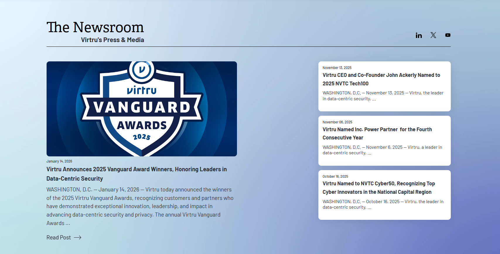
Based on research insights, I redesigned the newsroom layout with a stronger visual hierarchy and introduced a persistent sidebar that follows the user while scrolling. This allowed quick access to key sections without disrupting content flow.
A major addition was a newly created media kit section, placed at the bottom of the page for clear discoverability while maintaining a clean top-level layout. Content was reorganized into clearly defined sections to improve scannability and reduce cognitive load.
Throughout the process, I iterated on layouts and structure while collaborating with stakeholders to ensure alignment with Virtru’s communication strategy and technical requirements.
Solution
The final design delivers a streamlined newsroom experience that prioritizes clarity, accessibility, and usability. Key improvements include:
A persistent sidebar for easier navigation
Improved content hierarchy and spacing
A fully accessible media kit with press-ready assets
Clearer structure aligned with journalist expectations
Impact & Outcome
The redesigned newsroom better supports Virtru’s external audiences by making critical information easier to find and understand. By addressing usability gaps and aligning with industry standards, the solution strengthens Virtru’s credibility and improves the overall press experience.
Reflection
This project reinforced the importance of stakeholder collaboration and competitive research in UX design. Designing for professional users—such as journalists—requires balancing efficiency, clarity, and brand integrity, all of which guided the final outcome.