Climate Crisis Magazine
Concept & Intent
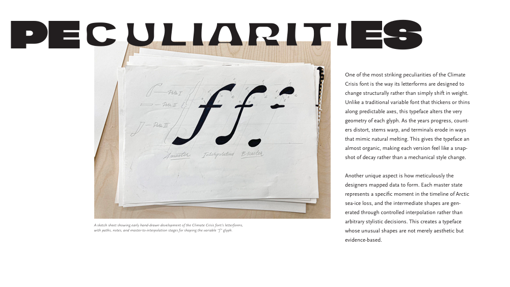
The core concept is type as message. Rather than using the font to support unrelated content, the magazine interrogates the font directly—how it looks, where it comes from, and what it communicates in the context of climate anxiety, urgency, and activism.
The design leans into contradiction:
A bold, distressed display font paired with analytical, academic-style layouts
Emotional headlines set against restrained grids
Visual tension between clarity and disruption
This mirrors the climate crisis itself: structured data colliding with chaos.
Project Overview
This magazine is a typographic project centered on the Climate Crisis font—not as decoration, but as subject matter. The publication examines the font’s form, history, cultural meaning, and emotional impact, positioning typography itself as both content and commentary. Each wide page functions as a full spread, reinforcing the idea that the font deserves space, attention, and immersive scale.
The overall design language is editorial, research-driven, and intentionally stark, echoing the urgency embedded in the font’s name and visual weight.
Use of the Full Spread
Rather than treating each page as an isolated unit, the magazine is designed so that each wide page functions as a single, unified spread. This decision emphasizes continuity and scale, allowing typographic elements—especially headlines set in Climate Crisis—to extend across the gutter.
Using the full spread serves several purposes:
It gives the type room to breathe and assert dominance, reinforcing the font as the primary subject
It creates a more immersive, cinematic reading experience
It resists the fragmentation that comes with page-by-page layouts, instead encouraging readers to engage with each spread as a complete visual argument
By allowing content to span both pages, the design mirrors the idea that the climate crisis itself cannot be contained or compartmentalized—it exceeds boundaries.

Layout & Grid
The magazine employs an asymmetrical grid system, rejecting rigid symmetry in favor of visual tension and movement.
Key characteristics of the grid:
Uneven column widths and varied text placement
Headlines that intentionally offset or disrupt the grid
Body text that anchors the layout and restores readability
This asymmetry introduces instability into the composition, echoing the unpredictability and imbalance associated with climate change. At the same time, the underlying grid ensures that the spreads remain controlled and legible, maintaining editorial credibility.
The contrast between structure and imbalance reinforces the project’s central theme: order strained under pressure.
Strong, consistent grid system across spreads
Headlines often break or push against the grid, while body text remains disciplined
Columns are used to maintain editorial credibility and readability
This balance between order and disruption is one of the project’s strongest qualities—it visually enacts the tension between control and crisis.
Strengths
Clear conceptual alignment between subject and form
Confident use of scale and negative space
Effective spread-based storytelling
Strong typographic hierarchy and consistency
Editorial tone feels intentional and research-driven
Conclusion
This magazine functions as both a typographic study and a cultural critique. By dedicating an entire publication to the Climate Crisis font, the project elevates typography from a supporting role to a narrative device. The spread-based format, restrained palette, and analytical structure reinforce the seriousness of the topic while allowing the font’s expressive power to remain central.
Ultimately, the design argues that type can do more than communicate—it can warn, provoke, and embody crisis itself.